

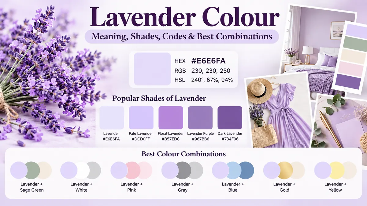
The lavender colour sits in the softer side of the purple family, combining the character of violet with a light, airy appearance. Named after the lavender flower, it is widely associated with calmness, refinement, spring, wellness, and gentle elegance. In digital design, the standard CSS lavender is represented by the HEX code #E6E6FA. Visily
Lavender colour is a pale, cool-leaning shade of purple or violet. The standard web version is #E6E6FA, with RGB values of 230, 230, 250. It works particularly well with deeper purple, sage green, cream, charcoal, soft pink, blue, and muted gold. PaletteHex
The word “lavender,” however, does not always describe one exact colour. The natural flower includes stronger violet-purple tones, while designers may use the name for everything from near-white pastel lavender to deeper floral lavender. Understanding those differences makes the colour much easier to use successfully.
What Is Lavender Colour?
Lavender colour is generally described as a light purple with a noticeable blue or violet influence. It belongs to the broader purple family but has considerably more lightness than classic purple.
Its name comes directly from the lavender plant. Interestingly, the standardized web colour is considerably paler than many actual lavender flowers. A stronger floral lavender such as #B57EDC can look closer to what people imagine when they think about the flower itself. Color Tutorial
That explains why two products described as “lavender” may look surprisingly different. One could appear almost white with a violet tint, while another could look like a recognizable medium purple.
Lavender Colour Code
For web and digital applications, the most established lavender specifications are:
| Colour format | Standard lavender value |
|---|---|
| HEX | #E6E6FA |
| RGB | 230, 230, 250 |
| HSL | 240°, 67%, 94% |
| CMYK approximation | 8%, 8%, 0%, 2% |
These values describe the CSS named colour lavender. PaletteHex
The RGB numbers reveal why the colour looks so pale: red and green are both at 230, while blue reaches 250. All three channels are high, creating a very light colour, but the additional blue gives lavender its cool violet character.
It is worth remembering that lavender is a colour family as well as a standardized digital colour. Different paint, fashion, printing, and design systems may therefore assign different values to a shade carrying the lavender name.
What Does Lavender Colour Look Like?
Imagine purple dramatically softened with white. The result is a delicate pastel that retains a recognizable violet or blue-purple undertone without the intensity of conventional purple.
Standard #E6E6FA is extremely light. In fact, its HSL lightness is approximately 94%, so it can look almost off-white on a bright display. Visily
More saturated lavender shades have a much stronger personality.
This distinction matters when choosing colours online. If you search for a lavender dress, wall paint, flower, graphic background, or HEX code, you may encounter noticeably different interpretations.
A useful way to think about the family is:
- Pale lavender: very light and subtle
- Classic web lavender: soft blue-purple
- Floral lavender: brighter and more saturated
- Lavender purple: deeper and richer
- Lavender gray: muted with gray
- Pink lavender: warmer with a pink influence
- Lavender blue: cooler and closer to periwinkle
All remain connected through their soft purple character.
Lavender Colour Meaning and Symbolism
Colour meanings are influenced by culture and context rather than functioning as universal psychological rules. Still, lavender is commonly used to communicate qualities such as calmness, softness, refinement, freshness, and elegance. Design references frequently connect it with relaxation and wellness. Color Tutorial
Calmness and relaxation
Lavender frequently appears in bedrooms, spas, meditation products, wellness websites, candles, and self-care packaging.
Part of this association also comes from the lavender plant itself. Because people already connect the plant with soothing environments, its colour can inherit some of those associations.
Elegance and refinement
Purple has historically carried associations with status, wealth, and royalty. Lavender keeps some of that visual heritage but softens it considerably. Canva
Deep purple can feel dramatic or ceremonial. Lavender usually feels lighter, quieter, and more approachable.
Romance and softness
Lavender works naturally in romantic visual settings without relying entirely on pink or red. That makes it common in wedding palettes, floral arrangements, invitations, spring decorations, and delicate fashion combinations.
Creativity
Because lavender remains part of the purple family, it can also communicate imagination and individuality. Stronger lavender-purple tones tend to emphasize this quality more than extremely pale versions.
Quick takeaway: Lavender is most useful when you want some of purple’s elegance and individuality without its visual heaviness.
Popular Shades of Lavender Colour
There is no single shade that represents every use of the word lavender.
Several related colours regularly appear in digital palettes:
| Shade | HEX | General appearance |
|---|---|---|
| Lavender | #E6E6FA | Very pale blue-purple |
| Pale Lavender | #DCD0FF | Soft pastel violet |
| Floral Lavender | #B57EDC | Stronger floral purple |
| Lavender Purple | #967BB6 | Deeper muted purple |
| Lavender Blush | #FFF0F5 | Very pale pink-lavender |
| Medium Purple | #9370DB | Richer purple |
| Dark Lavender | #734F96 | Deep muted violet-purple |
| Periwinkle | #CCCCFF | More noticeably blue |
Colour references can differ in how they name individual shades, so HEX or RGB values are more reliable than names when exact reproduction matters. Examples such as floral lavender, pale lavender, and darker purple variants appear across current colour references. Color Tutorial
Light lavender
Light lavender contains substantial white and works particularly well for backgrounds.
Its low visual intensity allows cards, photographs, illustrations, and dark typography to stand out without the starkness of pure white.
Floral lavender
Floral lavender is much more saturated. A commonly used example is #B57EDC. Theme & Color
This version is useful when standard #E6E6FA feels too pale to establish a recognizable purple identity.
Dark lavender
Dark lavender moves toward muted violet-purple. These deeper shades can work for headings, decorative elements, textiles, fashion, and stronger accents.
They are particularly useful when building a monochromatic palette because they provide contrast against pale lavender backgrounds.
Lavender vs Purple, Lilac, Mauve, and Periwinkle
Lavender is often confused with several neighboring colours.
The boundaries are not perfectly standardized, but their undertones make them easier to distinguish.
| Colour | Typical character | Compared with lavender |
|---|---|---|
| Purple | Strong, saturated red-blue mixture | Much darker and stronger |
| Lavender | Pale, usually cool purple | Soft and blue-leaning |
| Lilac | Pale purple with warmer/pinker influence | Usually pinker |
| Mauve | Muted purple with gray/pink influence | Dustier and more subdued |
| Periwinkle | Blue-violet pastel | Noticeably bluer |
Lavender vs lilac
This is probably the most common comparison.
Both are light purples, but lavender generally leans toward blue, while lilac tends to lean somewhat warmer or pinker. PixGrid
Place them beside one another and the distinction becomes easier to see.
Lavender vs mauve
Mauve tends to look dustier, grayer, and sometimes pinker.
Lavender normally looks cleaner and cooler. That makes pale lavender particularly suitable for fresh pastel palettes, while mauve often creates a vintage or subdued appearance.
Lavender vs periwinkle
Periwinkle moves farther toward blue.
If a pale purple starts looking almost like a soft blue, it is probably closer to periwinkle than classic lavender.
What Colours Go With Lavender Colour?
One reason lavender is so versatile is that it works with both restrained neutrals and stronger accent colours.
The right combination depends on the atmosphere you want to create.
Lavender and sage green
Sage green is one of the easiest natural companions for lavender.
The combination reflects colours found in botanical settings and creates an organic, relaxed palette. Current palette references commonly recommend sage or other natural greens alongside lavender. Theme & Color
Try:
Lavender + sage + cream
This combination works well for bedrooms, wellness branding, weddings, stationery, and lifestyle designs.
Lavender and white
White makes lavender feel clean and spacious.
Because #E6E6FA is already extremely pale, however, the two colours can have very little visual separation. Use darker text, borders, or accent colours where clear hierarchy is required.
Lavender and cream
Cream adds warmth to lavender’s cooler undertone.
The pairing is softer than lavender and bright white, making it useful for interiors, wedding themes, editorial layouts, and elegant packaging.
Lavender and gray
Gray produces a contemporary, restrained palette.
Light gray keeps the combination subtle, while charcoal provides much stronger contrast. Lavender with charcoal and white can work particularly well in modern digital layouts. Theme & Color
Lavender and pink
Soft pink creates a romantic pastel palette.
Choose blush or dusty pink for subtle results. Brighter pink produces a more playful appearance.
Lavender and blue
Blue reinforces lavender’s cool undertone.
Powder blue creates a quiet pastel combination, while navy or indigo introduces depth. Indigo is especially useful when pale lavender needs a much darker visual anchor. PixGrid
Lavender and gold
Lavender with muted gold creates a more luxurious impression.
This combination is particularly effective for wedding stationery, beauty packaging, jewelry presentation, invitations, and decorative accents.
Lavender and yellow
Yellow sits broadly opposite violet on the traditional colour wheel, so yellow-toned colours can produce lively contrast.
With pale lavender, soft lemon or creamy yellow keeps the overall palette gentle. A stronger yellow makes the contrast much more energetic.
Best Lavender Colour Combinations by Style
Rather than choosing colours individually, it helps to build a complete palette around the mood you want.
| Desired style | Suggested combination |
|---|---|
| Calm | Lavender + sage + cream |
| Minimal | Lavender + white + charcoal |
| Romantic | Lavender + blush pink + ivory |
| Luxury | Lavender + muted gold + deep purple |
| Natural | Lavender + olive/sage + warm beige |
| Fresh | Lavender + light blue + white |
| Bold | Lavender + indigo + bright accent |
| Pastel | Lavender + pale pink + mint |
For a monochromatic design, combine several lavender values instead: a pale lavender background, medium floral lavender accents, and a dark violet-purple for emphasis.
That creates depth while keeping the palette visually unified.
Is Lavender a Warm or Cool Colour?
Standard web lavender generally reads as a cool colour because of its blue-violet character. The standardized #E6E6FA value has an HSL hue of 240°, reinforcing its blue-side positioning. PaletteHex
But not every lavender shade has exactly the same temperature.
A blue-heavy lavender feels distinctly cool. Add more pink or red and the result becomes warmer. Add gray and it becomes more neutral.
This is why checking a physical or digital swatch is better than relying only on the colour name.
How to Use Lavender Colour in Interior Design
Lavender can work as either a background or accent, depending on its saturation.
Bedrooms
Pale lavender walls can create a soft alternative to white, beige, or gray.
Pair them with off-white bedding, natural wood, sage accents, and a deeper purple detail to keep the room from becoming visually flat.
Living rooms
Lavender does not have to dominate a room.
A neutral living room can incorporate the colour through cushions, artwork, curtains, flowers, rugs, or a single upholstered piece.
This approach is easier to update than committing every wall to purple.
Bathrooms
Lavender pairs naturally with white surfaces and light neutrals. Dark hardware, wood, stone, or charcoal accents can prevent the room from feeling overly pastel.
Small spaces
Very pale lavender can maintain an airy appearance because it reflects considerably more light than dark purple.
Still, always test paint in the actual room. Natural daylight, artificial lighting, surrounding furniture, and wall orientation can make the same paint appear cooler, warmer, grayer, or more saturated.
Lavender Colour in Fashion
Lavender became especially visible as a pastel fashion colour because it can provide colour without the visual intensity of saturated violet.
For an understated outfit, pair lavender with:
- White
- Cream
- Beige
- Light gray
- Charcoal
- Denim
- Navy
For a more expressive combination, experiment with sage green, soft yellow, pink, silver, or deeper purple.
The specific shade matters. A very pale lavender shirt can function almost like a neutral, whereas saturated floral lavender naturally becomes the focal point.
Metallic accessories can change the overall character too. Silver generally reinforces lavender’s cooler side, while gold introduces warmth and contrast.
Lavender Colour in Branding and Graphic Design
Lavender is frequently used where a brand wants to feel calm, creative, gentle, modern, or refined.
Potential applications include wellness, beauty, lifestyle, meditation, wedding, creative, and personal-care designs. Contemporary design references specifically highlight lavender backgrounds in wellness and relaxation-focused interfaces. Visily
But context matters.
Using pale lavender everywhere can weaken visual hierarchy. A better approach is often to use lavender for large surfaces and introduce darker colours for typography, navigation, buttons, and other important interface elements.
Lavender in web design
The CSS named colour can be written as:
background-color: lavender;or:
background-color: #E6E6FA;Both produce the standard CSS lavender colour.
For consistent branding, however, define your chosen shade precisely rather than relying on a general colour description.
Lavender Colour and Accessibility
This is an area that aesthetic colour guides sometimes overlook.
Standard lavender #E6E6FA is extremely light. Its contrast ratio against white is only about 1.23:1, while its contrast against black is approximately 17.06:1. PaletteHex
That has an immediate practical consequence: pale lavender and white may look attractive together, but they should not automatically be used as foreground/background colours for important text.
Under WCAG contrast guidance, normal text generally requires at least 4.5:1, while large text generally requires at least 3:1.
For websites and apps, treat pale lavender primarily as a background or decorative surface and use sufficiently dark typography on top.
For example:
Good approach:
Lavender background + black or very dark charcoal text.
Risky approach:
Lavender background + white body text.
Accessibility should be checked using the exact colours in the final design because even small shade changes affect contrast.
How to Make Lavender Colour
The method depends on the medium.
Mixing lavender paint
Start with purple, then gradually add white until you reach the required lightness.
If the purple looks too warm, introduce a very small amount of blue. If it becomes too blue, adjust with a warmer red-purple.
The key is gradual adjustment. It is much easier to darken a pale mixture slightly than to recover an exact pastel after adding too much strong pigment.
Creating lavender digitally
For the standardized web version, use:
HEX: #E6E6FA
or:
RGB: 230, 230, 250
For stronger flower-inspired colour, #B57EDC is a commonly referenced floral lavender. Theme & Color
Printing lavender
Digital and printed colours are not automatically identical.
Screens create colour with RGB light, while conventional printing commonly uses CMYK inks. A digital lavender may therefore shift when printed.
For important branding, packaging, invitations, or commercial print work, request a physical proof instead of assuming the screen preview is exact.
Common Mistakes When Using Lavender
Lavender looks simple, but a few mistakes can quickly make a palette less effective.
The first is assuming every lavender is #E6E6FA. That code is the standardized CSS colour, not the only legitimate lavender shade.
The second is using too many pastels without contrast. Lavender, blush, cream, pale blue, and mint can look beautiful together, but if everything has similar lightness, important elements disappear into the palette.
The third is using white text on pale lavender. Standard lavender’s low contrast with white makes this unsuitable for normal body text. PaletteHex
Another common mistake is ignoring undertones. Blue lavender and pink lavender can behave very differently beside beige, green, gray, or metallic finishes.
Finally, never trust a screen alone when selecting physical materials. Fabric, wall paint, paper, printing, and digital displays reproduce colour differently.
Why Lavender Colour Remains So Versatile
The enduring appeal of lavender colour comes from its position between expressive purple and understated pastel.
It can look botanical when paired with sage, romantic with blush, clean with white, modern with charcoal, luxurious with gold, or dramatic with indigo. That flexibility allows the same colour family to work across interiors, fashion, weddings, branding, packaging, and digital design.
For a reliable starting point, use #E6E6FA when you need the standardized web lavender and #B57EDC when you want a stronger floral interpretation. Then choose surrounding colours according to the mood and contrast you need. Most importantly, treat “lavender” as a family of pale purples rather than one rigid swatch—the exact undertone and lightness are what determine how successfully it works.
